A scattered route to the service
Customers moved between their account, support and international service pages. Some returned to the same screens while trying to find the right action.
Cellcom · International calling
Reviewing 42 recorded sessions changed the scope. A fix to an existing wizard became a dedicated self-service page for line status, included minutes and dialing guidance.
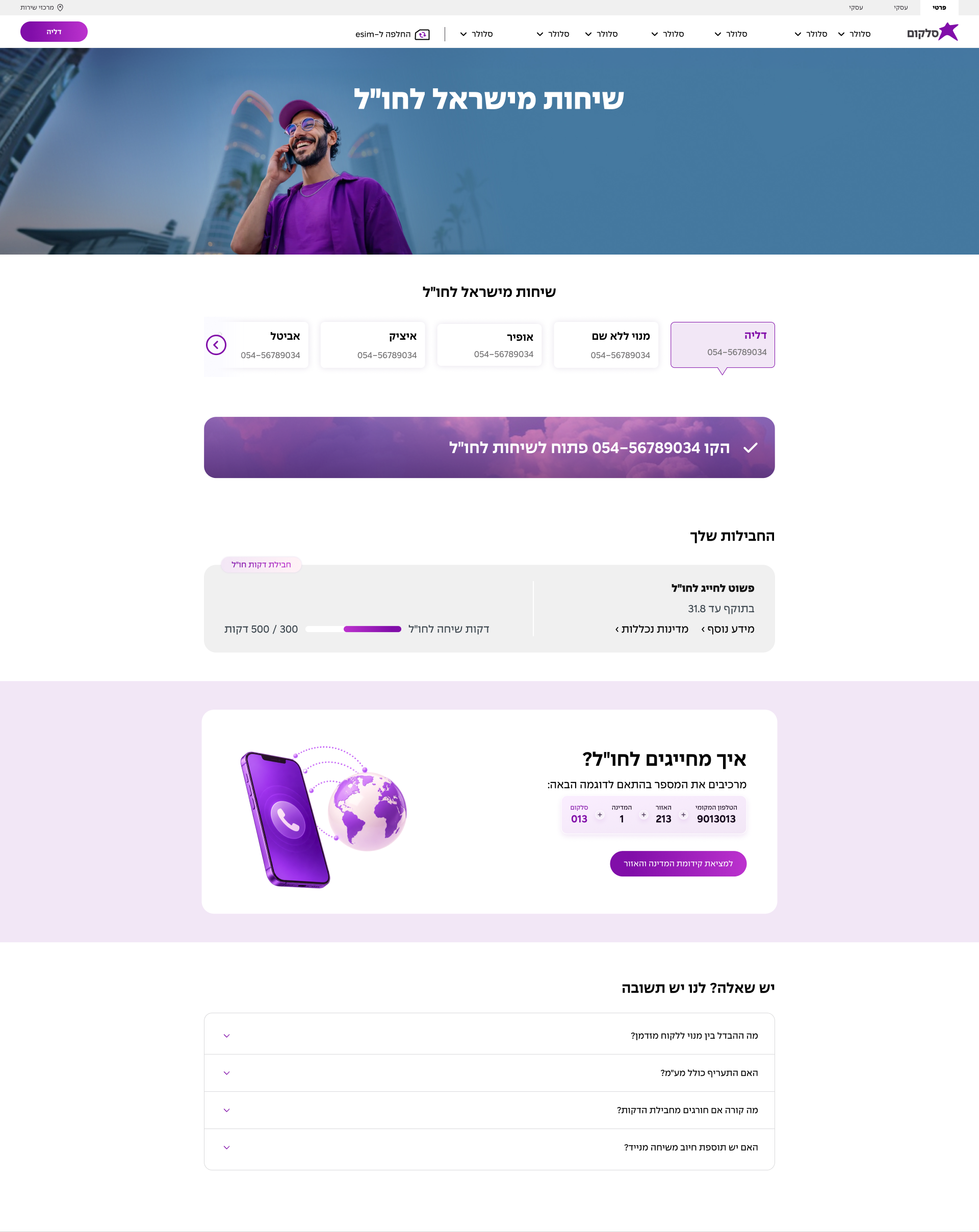

Current design in Figma · Responsive desktop and mobile views · Original interface in Hebrew
01 · The challenge
Customers moved between their account, support and international service pages. Some returned to the same screens while trying to find the right action.
People wanted to enable calls, check existing minutes, find dialing instructions, buy a plan or reach support. The wizard did not give each need a clear route.
An enabled line and an available minute allowance are separate conditions. Customers needed to understand both before deciding what to do.
I reviewed the session recordings, documented friction and wrote the research conclusions. Those findings led me to propose a standalone international calling page. I defined its information architecture, customer states and responsive flows, then developed alternatives and revised the specification with stakeholder feedback.
02 · Research
The route to enabling international calls was inconsistent. Repeated moves between account and support pages suggested that finding the action was part of the problem.
International minutes may be included in the regular mobile plan, even when no separate calling package has been purchased. The page needed to make that allowance visible.
In one recording, a customer clicked WhatsApp several times with long pauses, then left for another part of the site. The recording did not establish a technical failure, but it showed uncertainty after the action.
Notes: Figures describe the reviewed sample and its tagging, not all site traffic. A “successful” tag did not always confirm the customer’s goal, and some issues may have come from the recording tool, so I treated them as signals to check.
03 · Reframing the problem
The research broadened the brief from improving a wizard to defining a dedicated service page. I separated line access from minute allowance, then mapped the screen around what the customer could use or change.
04 · Reference research
I compared Israeli telecom services with examples from Mobbin and adjacent products such as VPN and eSIM apps. I looked at how they explained an active service, presented existing allowances and introduced the next action.
What I took from it: HOT 017 kept the plan, included destinations and a dialing diagram on one page. That supported putting status, allowance and dialing help together on a single service page.
Notes: Captures are from the original research, not a fresh audit of the live sites.
05 · Design decisions
I put the line status first and distinguished minutes included in a mobile plan from a separately purchased package. Customers should be able to check what they can already use before making a purchase.
I proposed hiding the plan list while minutes remained, then revealing available packages through an expandable component once the allowance was used up. I also specified the stakeholder-requested alternative, with add-minutes and buy-plan actions inside the active plan component.
I specified a short diagram separating the fixed 013 carrier prefix from the country code, area code and local number. I explored country search in a bottom sheet on mobile and a centered dialog on desktop.
During review, I moved the guide ahead of the plans in the UX specification.
Notes: The purchase options were alternatives for review. The current design shows an exhausted-allowance message and a purchase prompt, not the proposed expanding list. Adding minutes to an existing package required business confirmation, and the dialing guide’s placement continued to evolve in the visual design.
06 · Iteration
I developed both approaches, then revised grouping, labels and hierarchy to fit Cellcom’s components and stakeholder requirements.
I aligned anchor labels with section headings and adjusted navigation for signed-in customers and the broader international services hub.
Adding minutes and closing the service required confirmation. I documented those questions and avoided encouraging closure while the policy remained unresolved.
07 · Current design
I defined the page structure, hierarchy, customer states and component behavior. The visual layer was designed together with the team’s UI designer, within Cellcom’s design system.
Notes: Figma captures from October 12, 2026. Some details differ from the alternatives explored during the UX process. The interface is in Hebrew.
08 · Result
I started by investigating an existing wizard. Seeing customers return for different reasons led me to propose a standalone page instead. My specification for mobile and desktop covers the page, customer and service states, package behavior, dialing guidance, country search and supporting content, and the page is now in development.
Notes: The page has not launched yet, so these are proposed measures, not reported results.
Next case study