No visible progress
Generic meditation experiences rarely made the immediate effect or long-term value feel tangible.
Airly
A focused wellbeing concept that combines short guided breathing, biofeedback and gentle habit support for people who do not have time for a long wellness routine.
01 · The challenge
Generic meditation experiences rarely made the immediate effect or long-term value feel tangible.
When stress was already high, long sessions and content-heavy interfaces created another barrier.
Missed sessions often felt like failure, making consistency harder instead of more supportive.
I explored how short guided sessions, simple health feedback and encouraging reminders could work together without making the experience clinical or overwhelming.
02 · Research
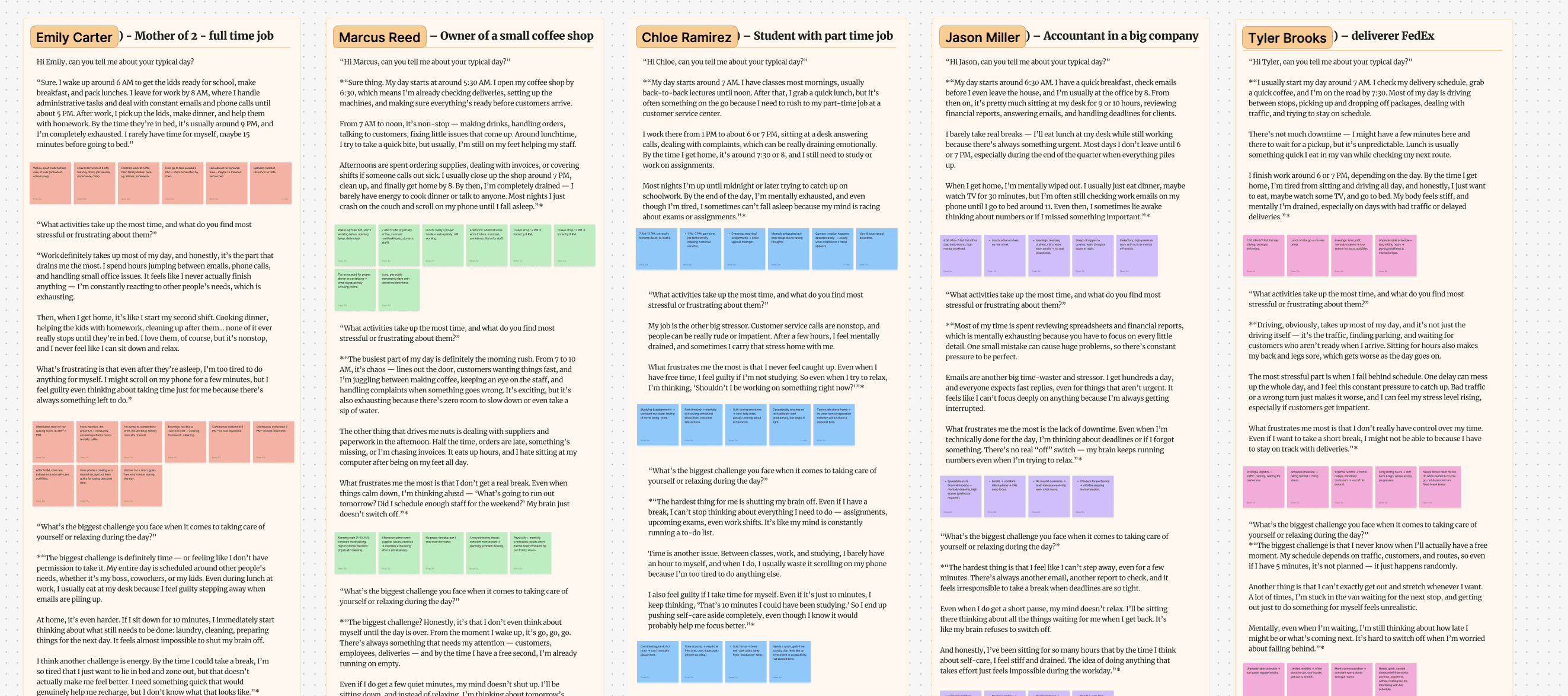
Wanted stress relief in under five minutes, preferred guided breathing and expected to feel an effect within one or two minutes.
Preferred audio-first guidance, smart reminders, simple mood tracking and a frame that made breaks feel productive rather than guilty.
The product needed to start quickly, guide without demanding attention and show that a short session created a real change.
03 · Competitive analysis
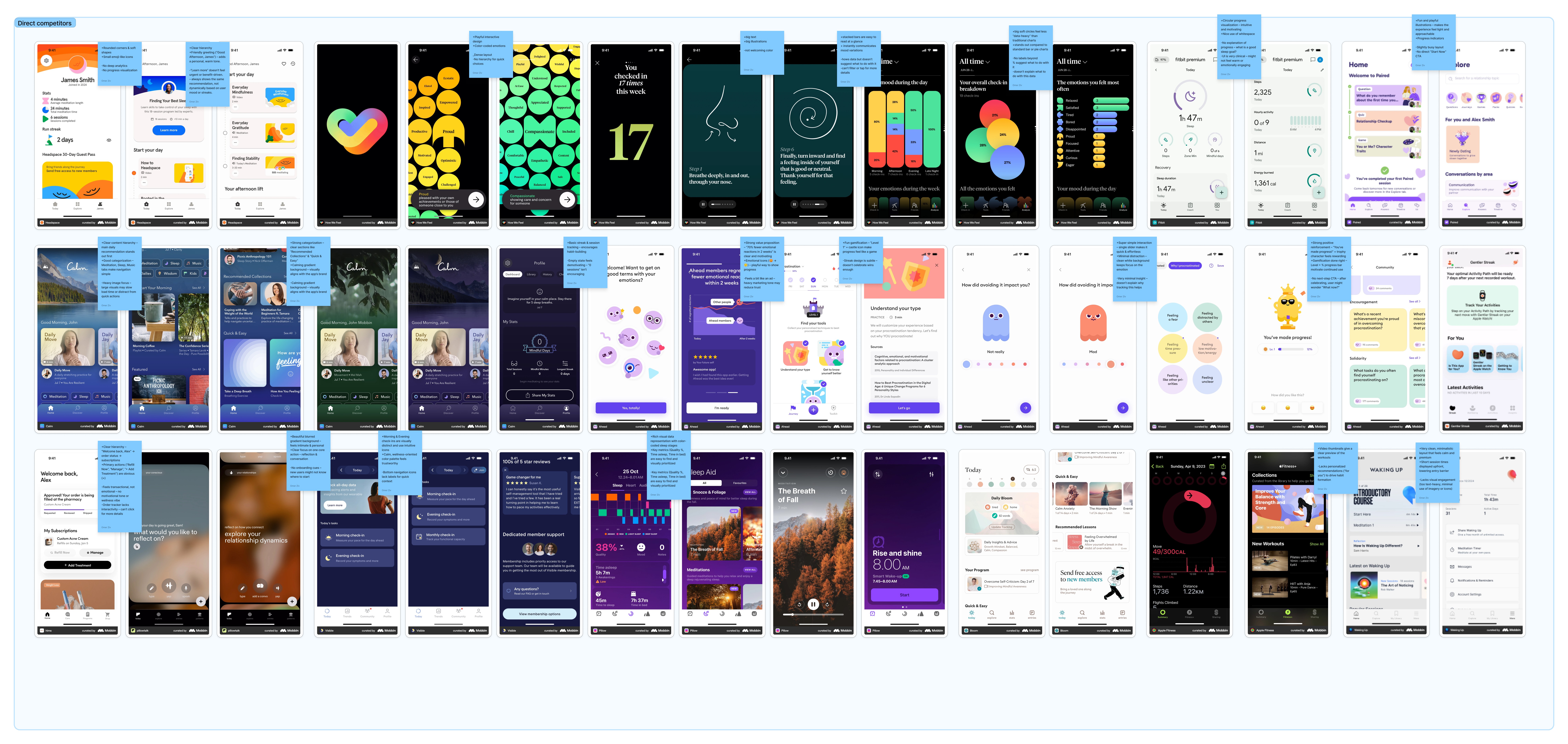
Calm visuals and smooth motion established trust before users began a session.
Onboarding quizzes tailored the experience but often asked stressed users to read too much.
Large libraries increased choice while making the right session harder to find.
Streaks supported retention but were rarely connected to real physical improvement.
Few products connected breathing to heart rate, stress or progress in an encouraging way.
Pair an emotionally calm experience with immediate, understandable biofeedback.
04 · Framing and ideation
Compare how the user feels with a simple physical signal before and after the session.
Translate health data into progress and reassurance rather than clinical judgment.
Suggest a useful micro-break in context without becoming another task or notification burden.
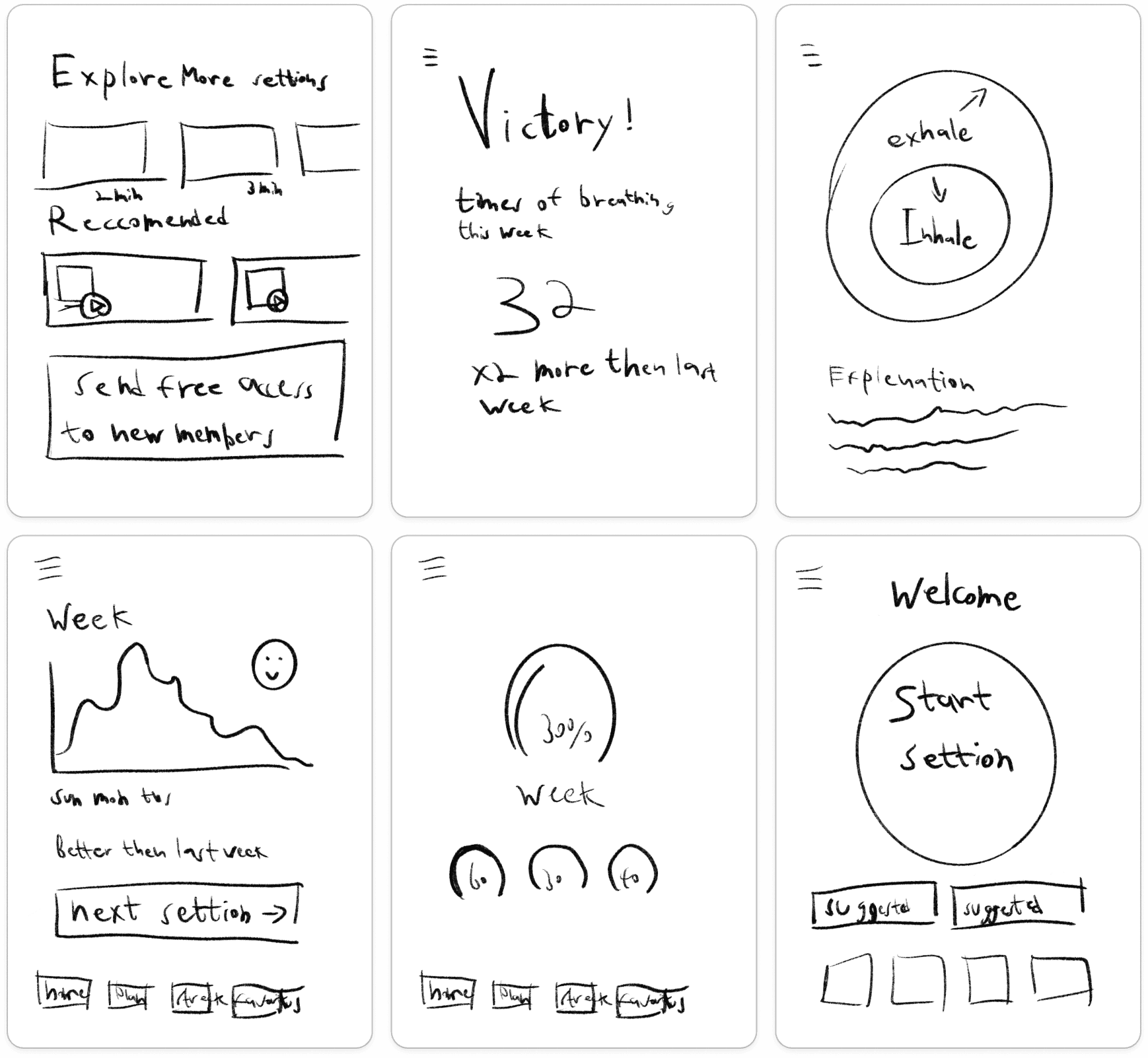
05 · Journey and iteration
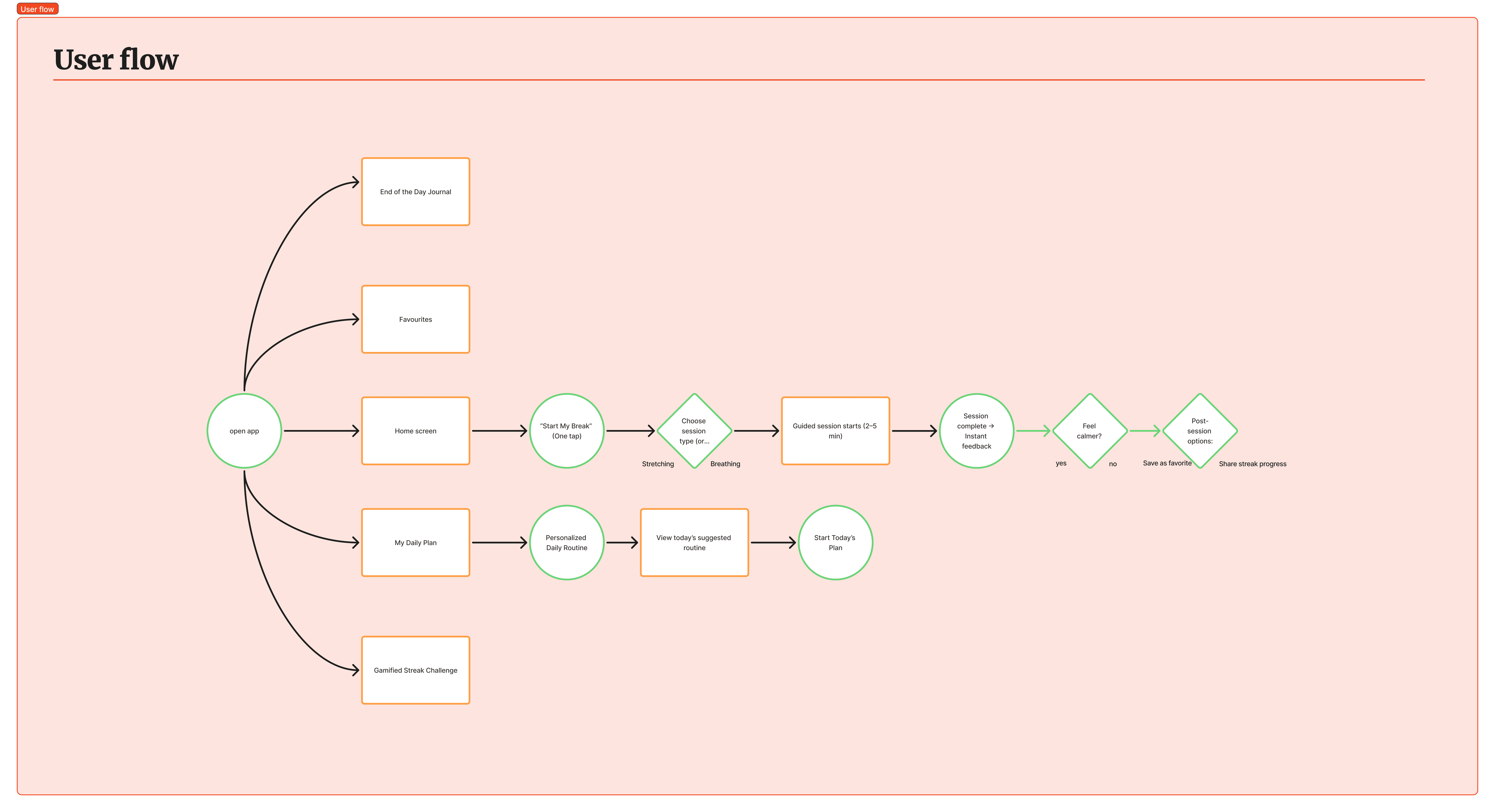
A “Start My Break” recommendation reduces choice and lowers the effort needed to begin.
Visual rhythm and audio guidance support the exercise without adding cognitive load.
Immediate feedback, a small celebration and an optional reflection make the effect visible.
External sensor connection, short-format sessions and explanations of what contributed to calm.
Navigation became simpler, progress copy became more encouraging and session visuals became more consistent.
When the user is stressed, every extra decision is part of the problem the product must remove.
06 · The solution
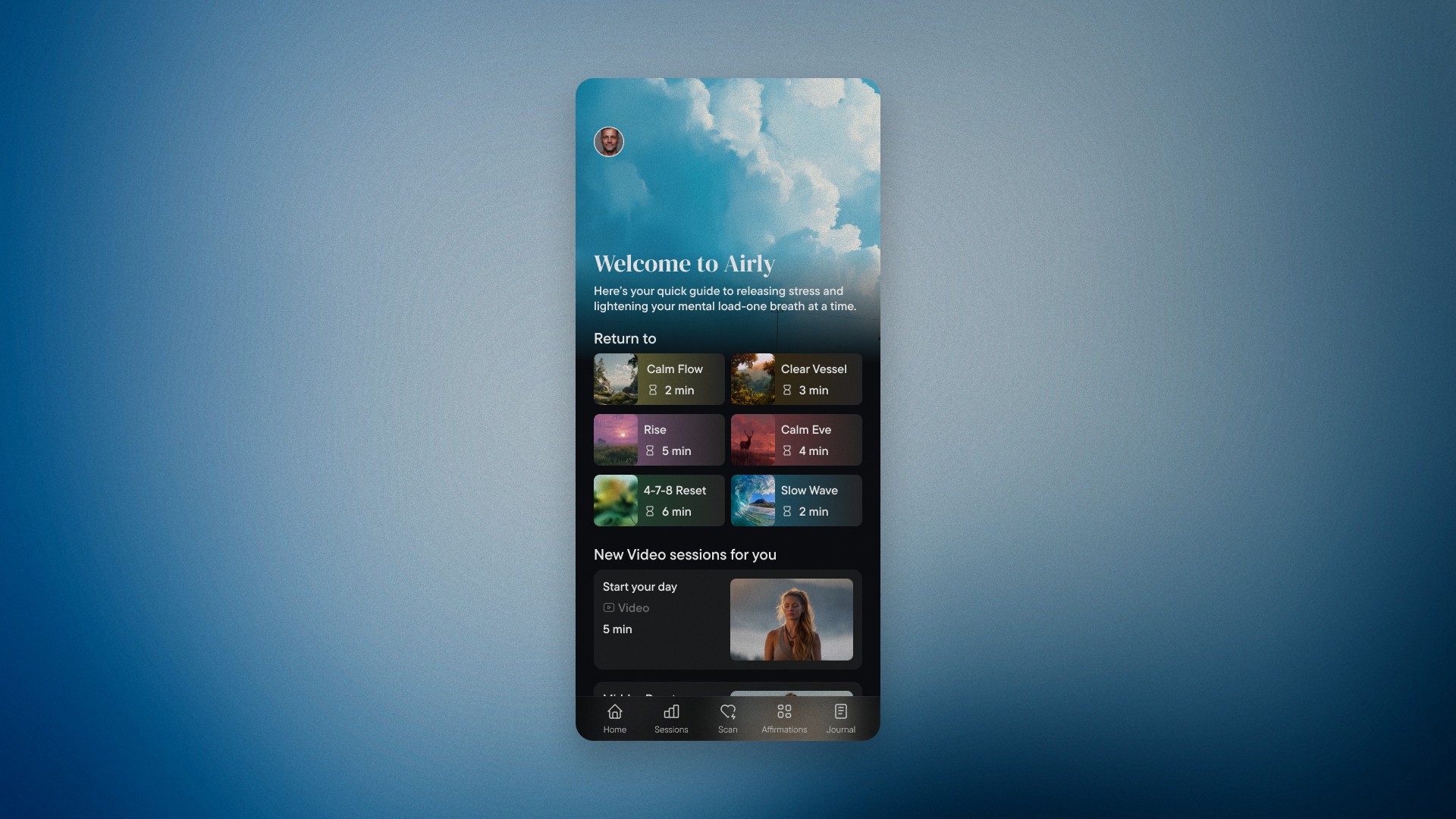
The opening view prioritizes a useful session for the current moment instead of presenting a large content catalog.
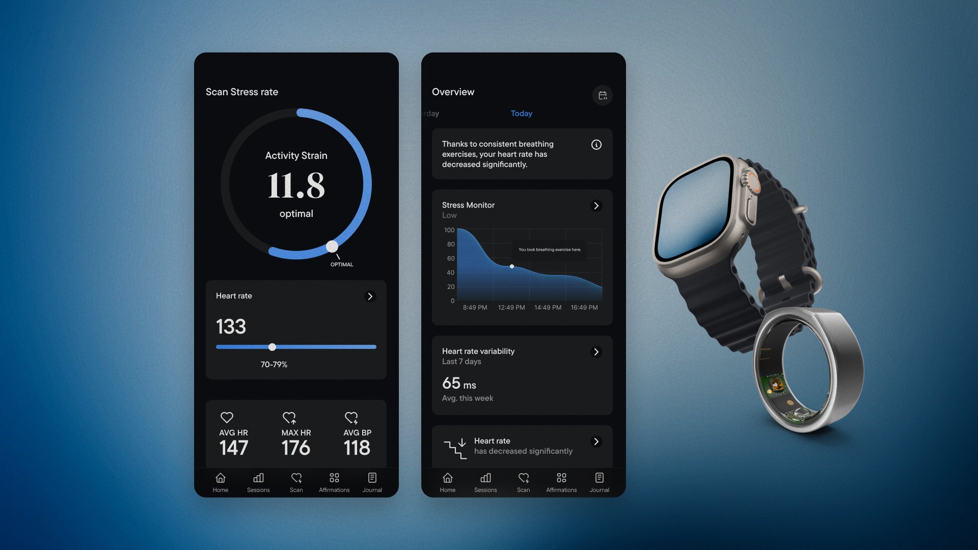
Stress scans and progress trends translate health signals into an encouraging story without turning the experience into a clinical dashboard.
The original 21-second prototype uses an expanding mandala, timed prompts and a distraction-free surface to carry the user through the breathing cycle.
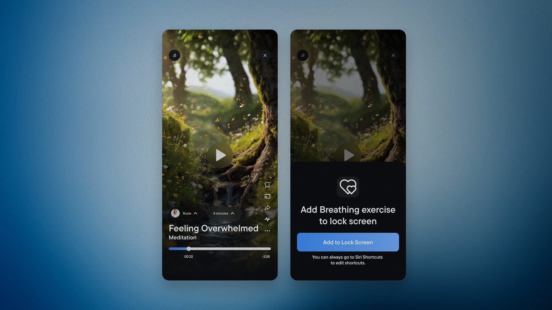
The meditation player minimizes controls, while lock-screen access lowers the friction of starting a familiar session.
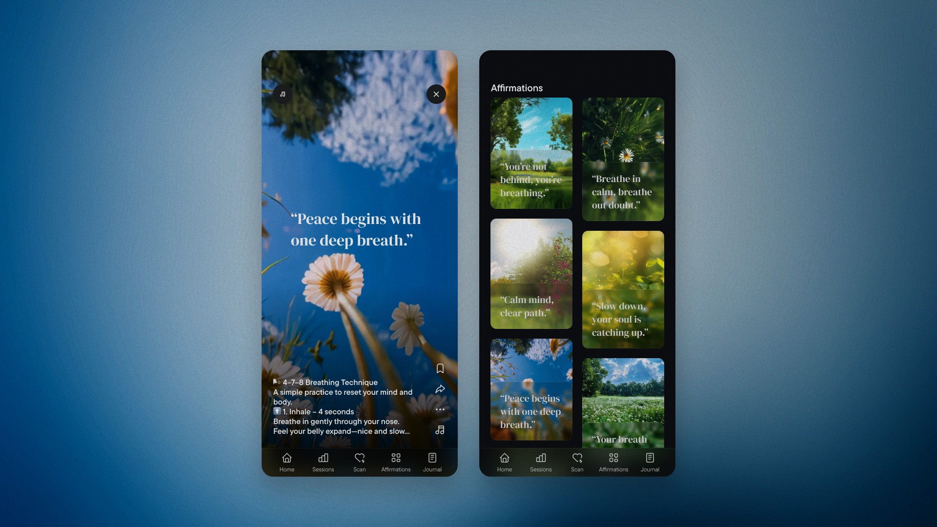
Affirmations can expand into a guided practice, connecting a reflective moment with a concrete stress-relief exercise.
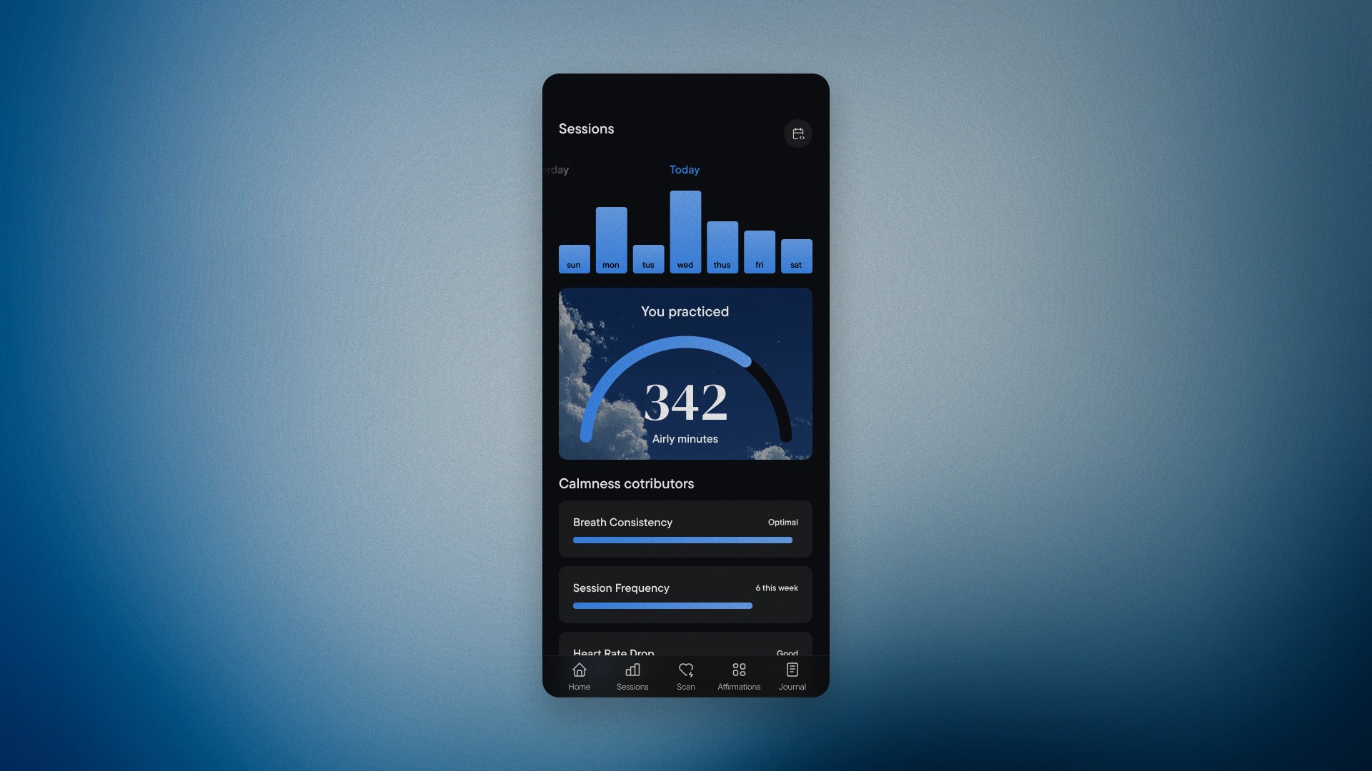
Sessions are organized around moments and needs, while weekly practice remains visible without creating content overload.
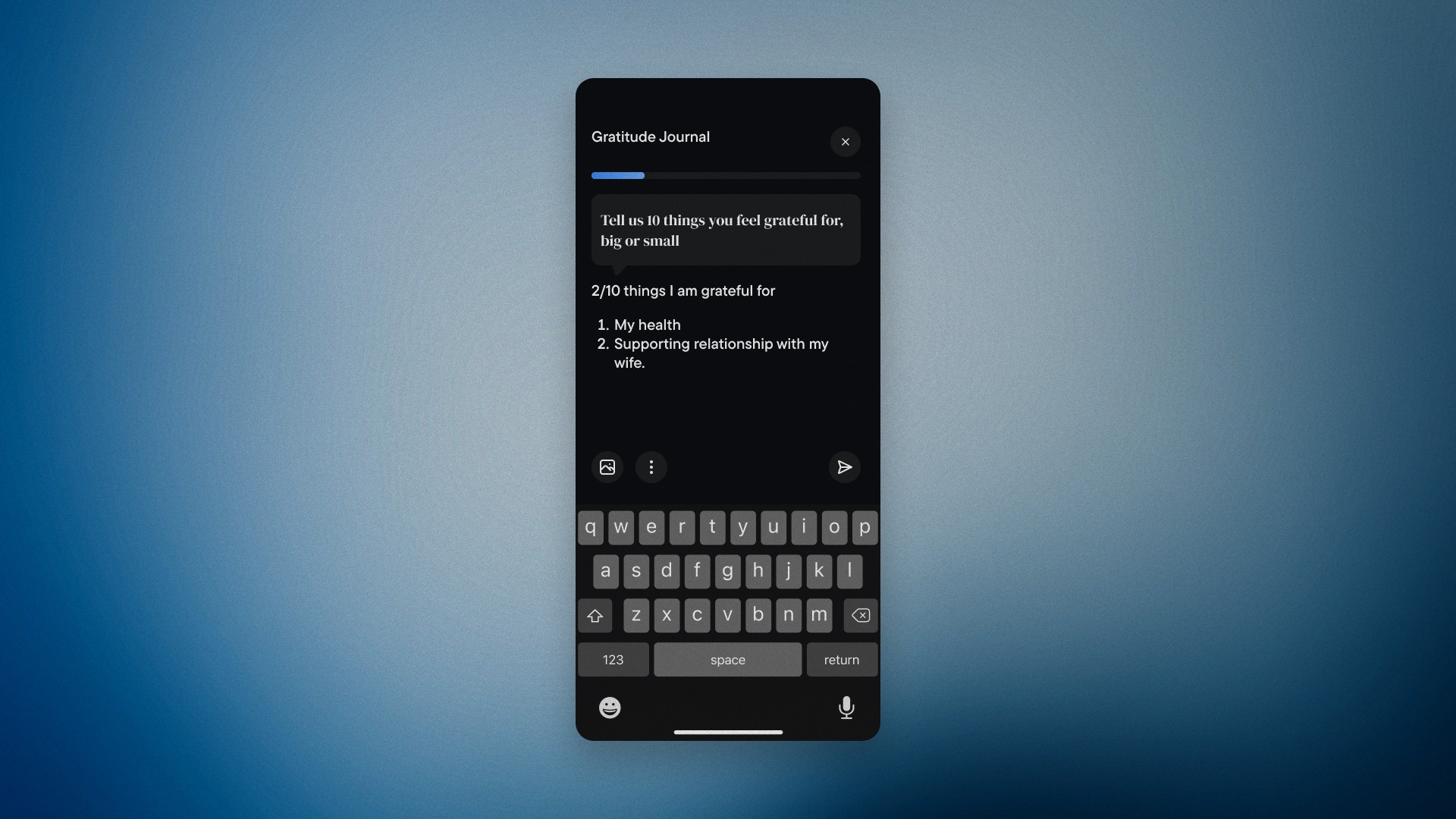
A lightweight gratitude journal gives users another way to notice progress while keeping participation optional and pressure-free.
07 · What I would explore next
The work reinforced that trust, focus and visible progress matter more than a large set of wellness content.
Every layer of the experience should help the user begin quickly and leave with a clear sense that the pause was worthwhile.
Next case study